
Gaia Wearables
|
Companion App UX
|
2018
How user research shifted product focus and reduced manual tracking burden for autism caregivers
UX Designer on a three-person team featuring two other designers
The Gaia team had created a few mock-ups of a mobile app to provide a visual interface for users to read data reported from the vest. However, they came to us to utilize research and design thinking methods to explore what their users would need and want from this product.
B2C
iOS and Android
Prototyping
UX Design

The Gaia team had created a few mock-ups of a mobile app to provide a visual interface for users to read data reported from the vest. However, they came to us to utilize research and design thinking methods to explore what their users would need and want from this product.
Gaia is a company spun up by a team of students at the Rochester Institute of Technology. Headed by Brent Chase, whose younger brother was diagnosed with autism at a young age, they share a passion for coming up with creative digital and physical solutions to problems that families with children with autism have faced for years. After finishing their capstone project, they took this idea further by winning a series of grants, most recently invited to present their product at SXSW. They presented our team with a new emotion-moderating vest called PAL. It is a device that reads biometric data from the person wearing it, and if it sensed from this data that they were about to reach a meltdown level, it would contract around them, simulating the feeling of a hug.

An example video of the prototype vest in action.
Each member of our team had only limited exposure to autism and the effects that the diagnosis has on families. With our time constraint and previous knowledge, we left the more direct device-related aspects to the team at Gaia, and we focused on the user interface side and learning about what the families deal with on a day-to-day basis. After our kick-off meeting with the client and early research to gather a baseline, we came up with the following hypotheses:
To prevent meltdowns in the future, parents/people with ASD need a mobile tool to understand what caused the meltdown in the first place.
PAL will improve the life of a person with ASD by providing a digital and tangible product to track, prevent, and understand meltdowns.
Each member of our team had only limited exposure to autism and the effects that the diagnosis has on families. With our time constraint and previous knowledge, we left the more direct device-related aspects to the team at Gaia, and we focused on the user interface side and learning about what the families deal with on a day-to-day basis. After our kick-off meeting with the client and early research to gather a baseline, we came up with the following hypotheses:
With this framework in mind, we examined the market to determine where Gaia's PAL fit within the marketplace and identified opportunities.
Wearables
Initially, my teammates looked more into the wearable space. Fun & Function, Squease Wear, and Pressure Vest were all creating wearable products that used weight and/or air compression to attempt to comfort a person in a stressful situation. Unfortunately, these products are relatively bulky and require various levels of supervision. They also offer no link to any digital products used to track biometrics. In turn, a parent or caretaker would have to find one of these products separately if they want to monitor the long-term usage of these wearables.


Digital Products
While my teammates looked at the wearables, I took a deep dive into the digital world of autism management. Digging up apps aimed at the same user as Gaia was a challenge, but after searching through many lists and trying to find applicable analogs, I found a handful. They generally targeted one of the two possible audiences: The caretaker or the person with autism. Here is an example of each:
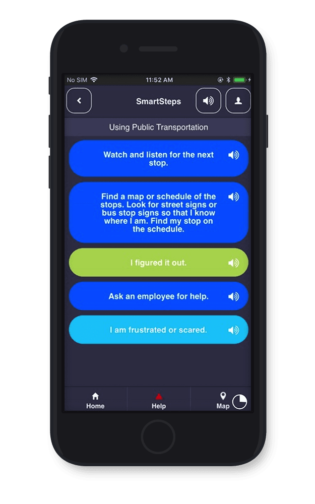
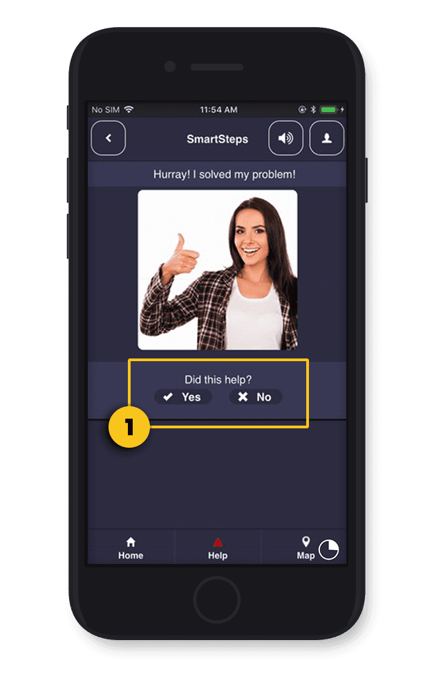
SmartSteps
SmartSteps is designed for a person with autism to use. When they are in a stressful situation, the app aims to ask the right questions to help them get out of it. Given that this is for high-stress moments, sending the person to an overwhelming survey page outside the app immediately after the case could trigger another episode rather than allowing them to cool down.

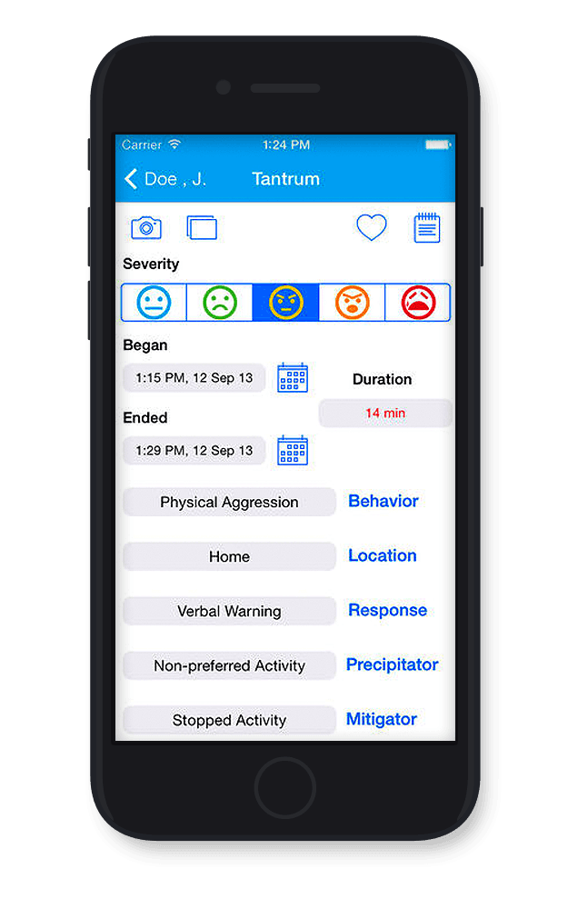
TantrumTracker
TantrumTracker is an app designed for caretakers of children with autism and ADHD to track the outbursts that often mark their lives. Keeping this tracking in one place can help identify patterns in behavior that caretakers can use to reinforce good behaviors and remove triggers. The app is entirely manual, which burdens the caretaker considerably when filling out these forms during high-stress situations.


Results
What I did find was heartbreaking. The market comprises many complex apps that do not effectively align with their intended use cases. Parent-facing apps featured extensive interaction requirements and a high learning curve. Apps aimed at children and adults with autism had many traps that could turn a meltdown into a full-on crisis. At any point in these apps, the user could fall into broken paths or, worse, face something altogether new and overwhelming. In our research, we found that sudden changes are a significant trigger of meltdowns, and these apps often employ inconsistent styles, redirecting the user to a mobile website with an entirely different look mid-usage.
There is a massive hole for automation of any kind. I found that time and again, tracking apps were full of complex forms that required manual input of detailed data. While in our research, we saw that parents of children with autism would go out of their way to educate themselves on the ins and outs of parenting these children. They had little time to mess with an app that forced them to input significant amounts of data manually.
We also considered how a digital or physical product can empower people's lives. From the very beginning, we realized that the name "TantrumTracker" might not resonate well. Choosing the correct language is crucial, as it can significantly impact a person's experience with a product, as we discovered during our user interviews.
We then conducted exploratory interviews with eight potential users and subject matter experts to find answers to many questions. Our overall goal was to gain first-hand accounts of how our users deal with day-to-day life when taking care of a child with autism. To gain a better understanding of how people currently prevent and manage meltdowns, and to explore any techniques or technologies they use to track the child's behavior, habits, schedule, etc., and whether a combination of PAL and a mobile app would address any of their needs or frustrations. We found these recurring themes throughout our interviews:
Busy Schedules
Parents had little time to fill out complicated reports to record outbursts. Thus, they don't keep detailed records.
Manually entering tracking data is too much for parents and aides due to their busy lifestyles, which makes it difficult for them to share information with all parties who care for the child.
Trigger causes
Meltdown triggers revolve around three main areas: sensory issues, difficulty when presented with something new, and the individual's rigidity in thought and behavior.
Examples of transition issues include:
Handoff to a caregiver
Last-minute schedule changes
New services
Independence building
Decision-making skills are generally weak and can only improve with practice.
Over time, children can improve these skills enough for many of them to live independently.
Their scheduling must be visual, not just verbally communicated, to increase decision-making skills.
Dropping support
There are mandatory services until graduation from high school, but afterward, it can become a considerable challenge and burden on the parents to continue.
Coming into the project, our team realized the scope of ages and degrees on the spectrum was very wide, and we probably wouldn't be able to use a one-size-fits-all solution. With our set of data, as a group, we looked at the situation and decided to focus on "parents of 18-24-year-old young adults with autism". By focusing on those children with the greatest potential to become independent adults, we had the opportunity to create a significant impact with our data. Parents need tools to help their children start living a separate life and for them to have peace of mind knowing their child is okay. In the future, Gaia will need to address various angles, including parents, younger children, older children, and the differences along the spectrum.
As our team agreed that this was shining through the data we had gathered, it allowed us to move on to problem definition. We could start considering how to translate this into bite-sized pieces for ourselves and our clients to move forward. To communicate our plan, we examined our audience, their pain points, and all that we have learned so far to create a single problem statement.
Problem statement
Parents of teenagers with autism who hope their children can gain independence need a mobile app that helps parents manage their daily lives and communicate with their children and those involved in their care. With this tool, they hope to identify patterns related to their stress levels that can lead them toward a more independent life.
With this combination of wearable technology, automatic digital management, and communication tools, we could accelerate the process of gaining independence. To help us stay on track with those goals, we built design principles to map our subsequent phases of design work.

Create Consistency
There should be regularity in product interactions to prevent surprises.

Low Learning Curve
It should be usable by a broad set of users, as they will have drastically different needs and backgrounds.

A Calm Voice
The app is used during times of stress. Its design should promote a feeling of calm and increase the sense of being in control.

Remain Focused
The technology should not overreach and fall into the background during everyday life. We don't want it to be a constant task.
We identified that these tools should help automate the manual tracking activities that parents cannot keep up with. In turn, our principles keep in mind that we don't want them to spend excessive time in the product and that people can use it with different levels of technical knowledge. Therefore, it should not be overly complicated to access the necessary information. We want it to feel like a safety blanket of reassurance for the parent and child during life changes.
When presenting the data to our clients, it became clear that they were looking for and expecting a younger target audience from us. With the client's background in hard science, we could demonstrate how the data supported our decisions. Each target audience eventually needs attention anyway, so to maximize the value Gaia got from our UX team's work, we would work on the areas where we had the most data. Being able to point out that going in the direction they were expecting would be basing our work on the same assumptions we came in with rather than on the new data and insights we provided was successful for Gaia.
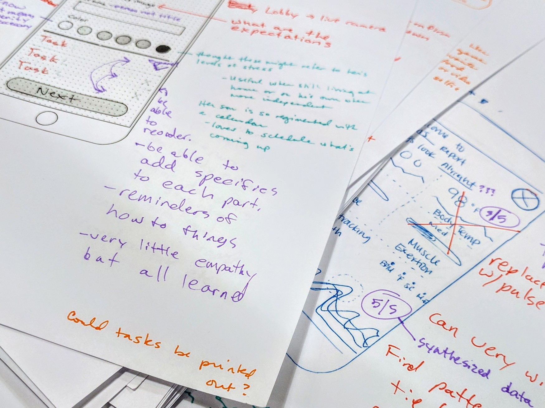
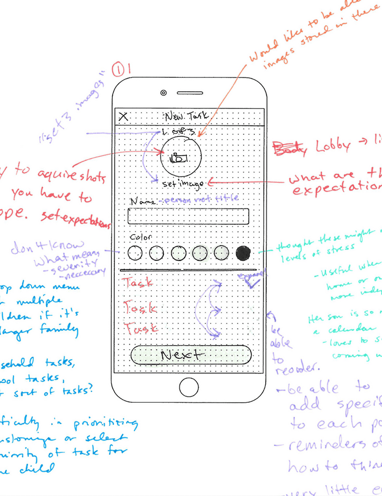
After conducting various ideation techniques, including 6-8-5 sketching, brain dumps, word maps, and more, we each developed concepts that explored different approaches to managing the emotional well-being of children with autism, with the goal of loosening the reins over an extended period. We examined these three different angles and sketched out multiple ideas to test within them, validating a final path.

With the data we had gathered so far, there was considerable variance in ideas, which would require testing more versions within each concept. While we worked on the overall ideas together as a team, we broke out the individual concepts to the person most closely associated with each research angle. I worked on self-regulation by analyzing direct and indirect competitors using visual calendars and scheduling tools. I worked swiftly to devise designs that communicated quickly and visually without overpowering or distracting the user.
After conducting various ideation techniques, including 6-8-5 sketching, brain dumps, word maps, and more, we each developed concepts that explored different approaches to managing the emotional well-being of children with autism, with the goal of loosening the reins over an extended period. We examined these three different angles and sketched out multiple ideas to test within them, validating a final path.
An example video of the prototype vest in action.
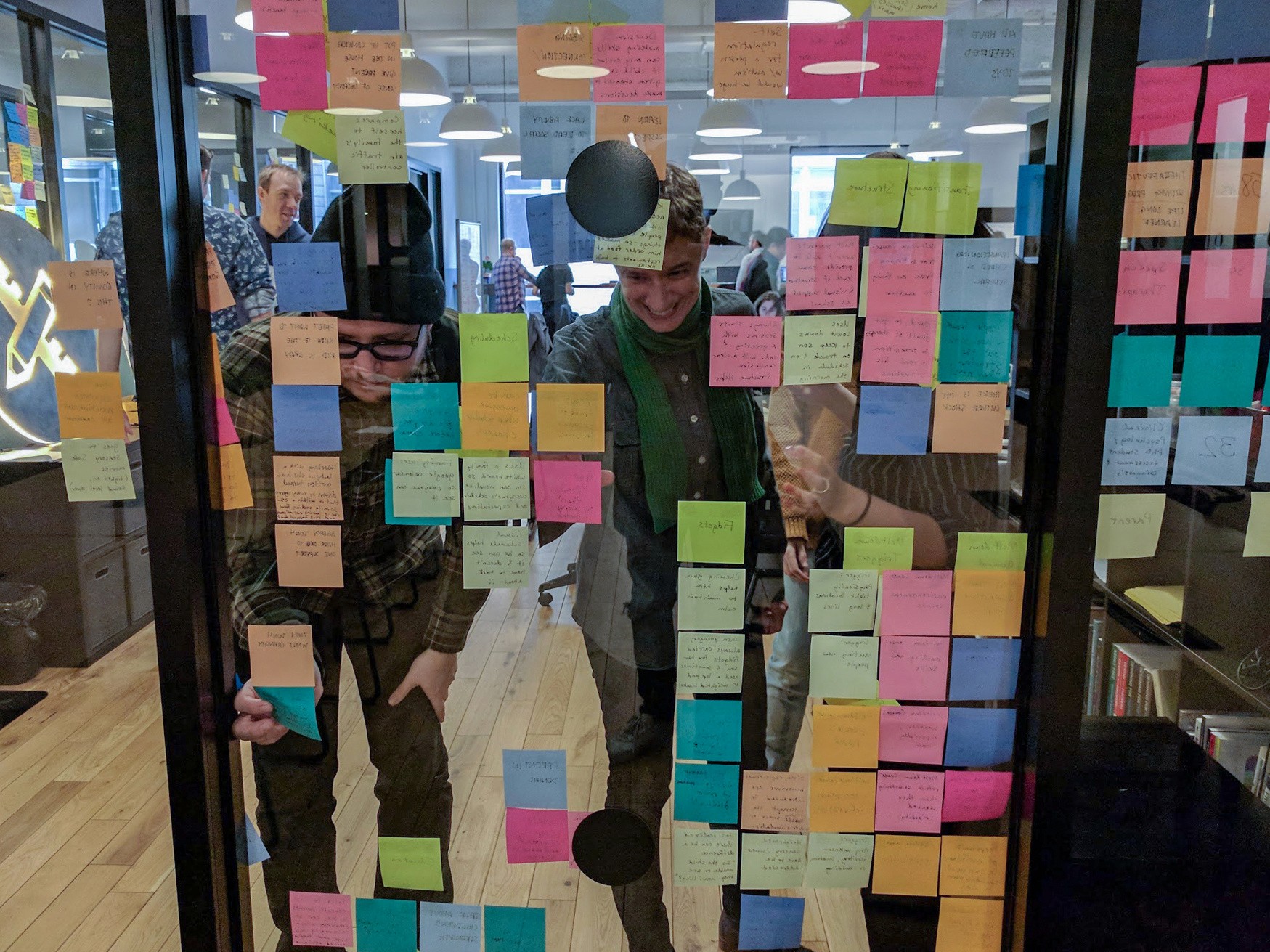
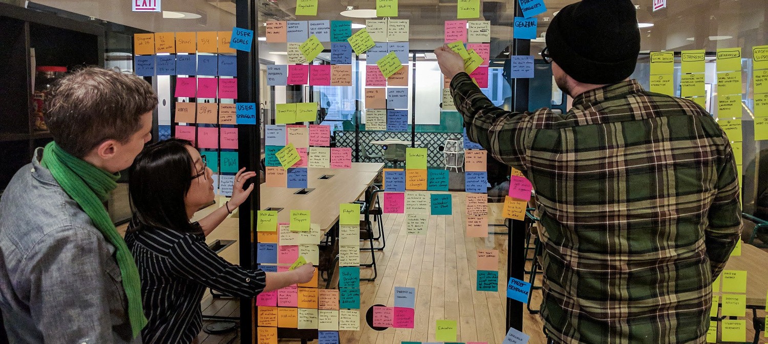
We put these concepts in front of users to determine their usefulness and desirability. Knowing the limited amount of time, we needed to tighten in on a specific area that would be of most value to our potential users. Because of that same time crunch, for this round of testing, I thought to print out all the slides so we could physically draw on them in different colors, which brought a whole new way to synthesize visually by drawing with different colors on one set of drawings to quickly start to identify patterns. It spoke to my visual side in ways the affinity diagram usually doesn’t, as it is entirely contextual with the concept as it sits. We found a couple of results that helped us focus our attention and solve some lingering questions:
Product Prioritization
Users we spoke to already use an iCal/Google Calendar solution and found it to be something they could teach others. This new insight pushed us away from the last of the child-facing sides of the app we had considered and allowed us to focus strictly on the caretakers.
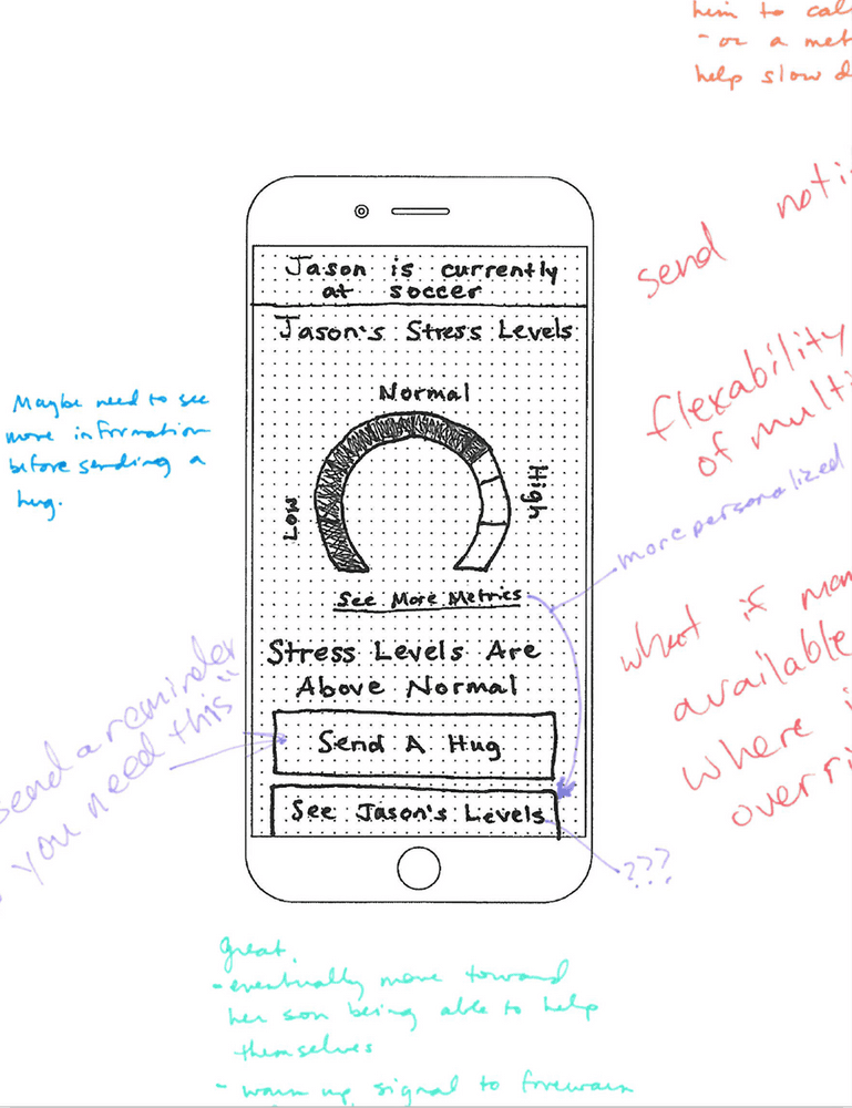
Synthesized data
The thing caretakers didn't have access to at that time was the data automation output from PAL. The only problem is that testers didn't know what to do with much of this information and wanted it in more consumable chunks.
Personalization
Parents wanted more options than initiating the compression hug on their child's vest. These included personalizing the length, frequency, and repeatability of the compression of the vest depending on their child's needs over time.
What even is skin conductivity?"
Every tester asked this question when presented with raw data because they were unsure how to interpret it.
A potential roadblock
Until our last week of working on this project, we had been concepting based on the information provided by our client, which primarily focused on the PAL vest's ability to sense an oncoming meltdown and its "hugging" feature that would mitigate the situation.
It turns out they had already pivoted away from crisis mitigation and were now focusing entirely on assessment. This situation presented us with an initial shock. Still, I quickly realized we had been designing this digital product to be scalable, as the Gaia team added more wearable gear beyond the PAL vest and presented that fact. I discussed with them how, thanks to the initial planning for scale, we would not lose the ground we had gained so far, and it would only require minimal tweaks to continue, which we would achieve.
Iteration
To kick off the final sprint, we created a flow that limited the steps in the app, allowing a parent to achieve their goal of opening it in any direction. I specifically wanted this to be an app that wasn't a chore, as our design principles stated. We wanted there to be a low number of steps from opening it to finding the desired piece of information.

Maintaining a consistent flow with a limited number of steps in any direction was crucial to staying within our design principle of remaining focused.
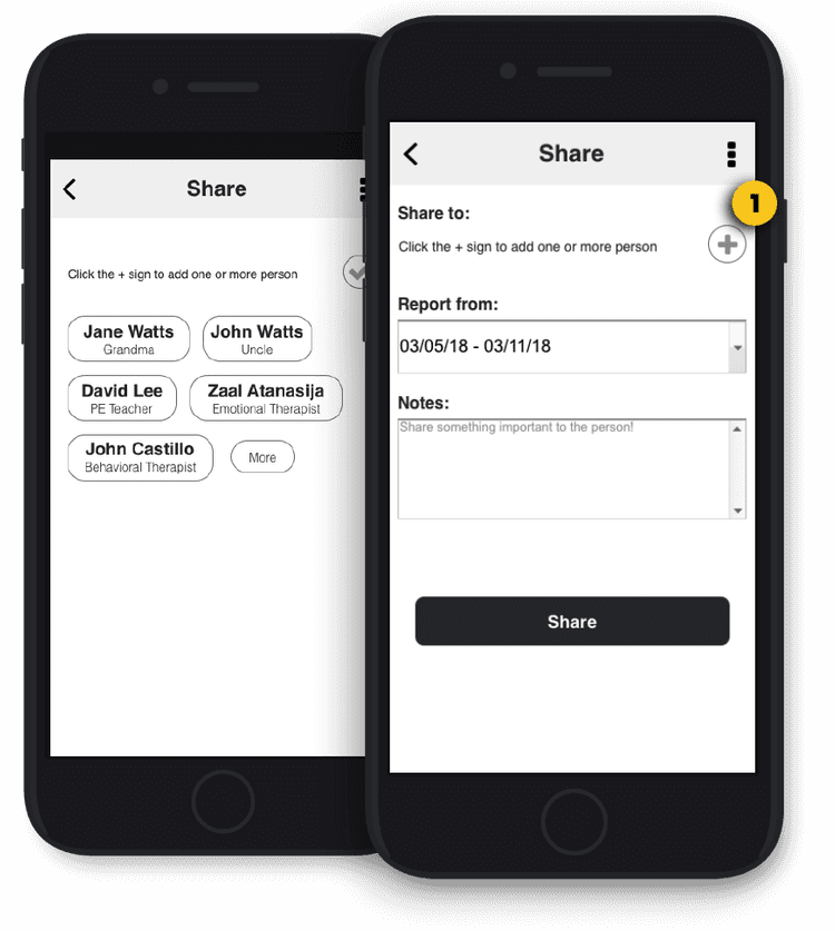
Focusing on three main areas of this flow, we split the tasks accordingly to prototype the main status page, the family, doctor, and teacher network, the sharing pages, and the reports page.
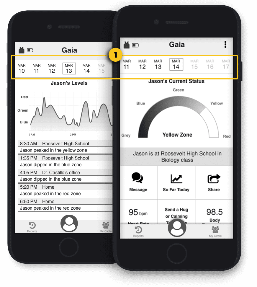


We conducted one final round of usability testing to determine if our newly converted product met our initial goals. Validating our decisions effectively to make caretakers' jobs easier was essential to setting up our future recommendations for Gaia before the final handoff.
Positives
Our findings indicate that the overall reaction to the app aligns with our goal of making it easy to use, but we identified areas for improvement over time.
Areas to improve
Roadmap
Personal Reflection
Designing for an audience with new types of needs during my last project at Designation presented a multitude of new, exciting challenges. As designers, we often get stuck on the ideal scenario of someone with a giant Retina Display who is tech-savvy, and it serves as a challenge and a reminder that there is still a broad swath of people who lack these skills. The simple act of talking to these people and sharing their pain as they tried to set up a video call was invaluable. The empathy gained in those situations was crucial when prioritizing features in a way that did not overwhelm them with the final product.
The Gaia project was my final complete project at Designation, and it became the culmination of what I had learned from my previous projects and jobs. I've spent a lot of time honing my skills in working with demanding clients in stressful situations, and on this project, I leveraged this aspect of my previous career, merging those skills with the UX skills I developed at Designation.
I drew on my previous design background when the path seemed unclear to guide our team in a direction that allowed us to remain flexible as client goals shifted under our feet. The reason I came to Designation, and what I excitedly got to present, was "the why" when we had to veer away from client expectations to give a confident explanation about the decisions made. It was a new world where confidence in decisions was based not only on intuition or previous experience but also on hard data.
